In this article, let us discuss cool bouncing ball animation using CSS.
Code in CSS
Below is the code for the cool bouncing ball animation using CSS.
<!DOCTYPE html>
<html lang="en">
<head>
  <meta charset="UTF-8">
  <meta name="viewport" content="width=device-width, initial-scale=1.0">
  <title>Bouncing Ball Animation</title>
  <style>
    body {
      display: flex;
      justify-content: center;
      align-items: center;
      min-height: 100vh;
      margin: 0;
      background: linear-gradient(45deg, #ffe3ce, #fad0c4);
      overflow: hidden;
      font-family: Arial, sans-serif;
    }
    .ball {
      width: 50px;
      height: 50px;
      background: #e93a92;
      border-radius: 50%;
      position: relative;
      animation: bounce 2s infinite ease-in-out;
    }
    @keyframes bounce {
      0%, 100% {
        transform: translateY(0);
      }
      50% {
        transform: translateY(-200px);
      }
    }
  </style>
</head>
<body>
  <div class="ball"></div>
</body>
</html>
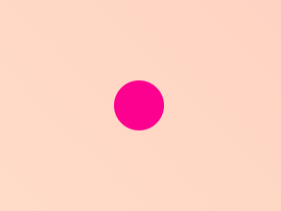
Output:
Explanation
HTML
- The
divelement with the classballrepresents the bouncing ball.
CSS
@keyframes bouncedefines the animation that makes the ball move up and down.- The
animationproperty applies the bounce effect with a 2-second duration and infinite repetitions. linear-gradientis used to add an attractive background.
How to Use
- Copy the code into a
.htmlfile. - Open the file in a browser to see the animation in action.
- Customize the animation timing, size, or colors as you like.
You can learn more about CSS here.
You can also read 5 important Digital Tools for every competitive exam aspirant.
Leave a Reply